
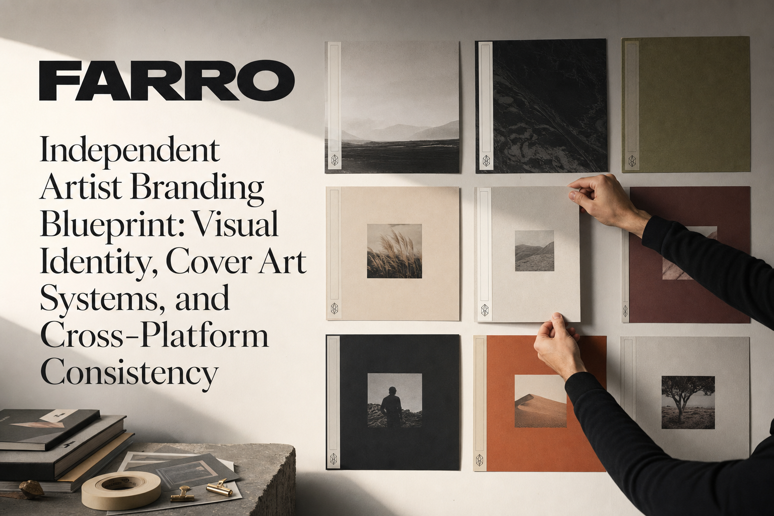
Independent Artist Branding Blueprint: Visual Identity, Cover Art Systems, and Cross‑Platform Consistency

Summary: This is a practical blueprint for independent artist branding. You’ll define a visual identity that matches your music, create a scalable cover art system, choose typography and colors (with multilingual script support), and keep everything consistent across DSPs, YouTube, and social—without needing a full design team.
What “independent artist branding” actually means (and what it’s not)
Brand = recognizable decisions (not just a logo)
Your brand is the repeated set of visual decisions that make people recognize your work at a glance: type, color, layout, imagery, motion, and how you place text. A logo helps, but consistency is what builds memory.
How visuals support your sound, story, and audience promise
Visuals should feel like your music sounds. If your sound is intimate and cinematic, your visuals may use soft light, negative space, and elegant type. If your sound is raw and percussive, you might lean into high contrast, bold typography, and tactile texture. The job of visuals is to set expectation, signal genre/world, and make your work findable again.
Outcomes to aim for: memorability, legibility, repeatability
- Memorability: Fans recognize you in a scroll.
- Legibility: Titles and names read clearly at small sizes.
- Repeatability: You can reproduce the system quickly for each release.
Build your visual identity core
Translate positioning into visuals (mood board, 5 adjectives, 3 references)
Start with clarity, not software:
- Mood board: 20–30 images (album sleeves, film stills, textures). Look for common lighting, framing, and color temperature.
- 5 adjectives: e.g., “romantic, modern, cinematic, warm, bilingual.” These guide every choice.
- 3 references: Visual references across music, film, or fashion. Define what you’ll emulate (and what you’ll avoid).
Logo/wordmark vs. signature: when to use each, when to keep art text‑only
- Artist logo and wordmark: Create a clean wordmark from your chosen type. Keep an icon/monogram only if you’ll use it often and small (favicons, avatars).
- Signature: Handwritten signatures add intimacy, but only use if they stay legible at 1–2 cm in print or 64–96 px on screen.
- Text‑only covers: If your music leans minimal or typographic, consider text‑only single art—great for series consistency and speed.
Typography system
- Primary display: For titles and bold headlines (the “voice” of your brand). Choose a face that holds personality at large sizes.
- Secondary text: For artist name, credits, and small captions. Prioritize readability and a wide weight range.
- Pairing: Serif + sans is reliable; or one superfamily across weights (keeps licensing simple).
- Licensing: Ensure your license covers album art, merch, and motion.
- Glyph coverage for multilingual scripts: If you work in multiple languages, test font glyph support for Urdu, Punjabi, Hindi, Spanish, and English. Confirm kerning, diacritics, punctuation, and numerals. Plan a fallback pair for scripts your primary display doesn’t support.
- Diacritics and numerals: Ensure accents (á, ğ, ñ) and Urdu/Devanagari numerals render correctly. Keep lining figures for uniform dates and episode numbers.
Color palette
- Core: 1–2 hero colors that feel like your sound.
- Neutrals: A light and a dark neutral that work for backgrounds and text.
- Accents: 1–2 high‑impact colors for calls‑to‑action, series codes, or seasonal variants.
- Contrast: Test contrast for small type and dark mode. Your palette must survive compression and platform UI overlays.
Photography direction
- Lighting: Soft vs. hard light, natural vs. gel color. Decide once and repeat.
- Framing: Centered portrait vs. negative space to the left/right for titles.
- Grain/texture: Keep one texture library (film grain, paper, noise) and reuse it across covers.
- Treatments: Duotone, light leaks, B&W, motion blur—pick 1–2 that belong to you.
Graphic elements
- Motifs: Simple shapes, lines, or icons that repeat (e.g., crescent, pulse line).
- Frames/borders: A thin border or frame can become your signature “spine.”
- Texture libraries: Keep consistent scale and intensity so assets look like one family.
Create a cover art system that scales
Grid and hierarchy
- Safe areas: Keep critical text 5–8% inside all edges to avoid platform cropping.
- Title → Artist → Label/Series: Fix a consistent type scale and placement.
- Edge discipline: Avoid crowding edges; leave breathing room for platform overlays.
Single vs. EP vs. album patterns
- Singles: Fast to produce, strong typographic anchor, flexible center image.
- EP: Keep a consistent “spine” (type/border) and vary imagery or accent color.
- Album: The master look. Singles from the album borrow the same grid and type but vary color or crop.
Series design for singles
- Color‑shifted sets: Same layout, different accent for each track.
- Motif rotation: Swap a motif position each release (top‑left → top‑right, etc.).
- Seasonal variants: Subtle winter/summer tone shifts while preserving the core system.
Multilingual titles on covers (visual focus only)
- Script support: Use a primary display that supports your main language. For Urdu/Punjabi/Hindi, test Naskh/Nastaliq/Devanagari forms in advance.
- Fallback pairing: If your hero font lacks a script, pair a matching script font for that line only.
- Line breaks: Give non‑Latin scripts generous line height; avoid fake stylization or pseudo‑translations.
- One primary script visually: If needed, select one script as the dominant visual and place others in secondary positions.
Alt versions
- Clean art: No text, for background use, EPKs, or lyric videos.
- Lyric video variant: Align opening frame with the cover’s grid and colors.
- Motion crop: Prep a 9:16 motion‑ready version for reels and stories.
File setup and naming
- Master file: One PSD/AFPHOTO/FIG with components and locked styles.
- Versioning: YYYY‑MM‑Title_V01–V10. Keep a CHANGELOG note layer.
- Export profiles: sRGB JPG for cover art; PNG for transparency; MP4 for loops.
Cover art dimensions and ratios (practical defaults)
- Official cover art: 1:1 at 3000×3000 px (minimum commonly accepted: 1400×1400). JPG or PNG, sRGB.
- Social crops: 1:1 (1080×1080), 4:5 (1080×1350), 16:9 (1920×1080), 9:16 (1080×1920).
- YouTube thumbnail: 16:9 at 1280×720 px minimum; keep key type within a 90% safe area.
- Spotify Canvas branding: 9:16 vertical loop; keep motion subtle with a clear focal area. Avoid heavy strobe.
Cross‑platform consistency without copy‑paste sameness
Master once, adapt many
Design in a master composition. Then export adaptations in 1:1, 4:5, 16:9, and 9:16. Keep the same type scale relationships, margins, and color ratios. Change crops or motion—not the system.
DSP touchpoints
- Release art: Matches the cover system.
- Artist image: Same photo direction and color treatment as the album cycle.
- Playlist cover: Use your “spine” type and brand colors for any official playlists you curate.
- Motion loops/Canvas: Define on‑brand motion rules (duration, speed, texture, no strobe) to keep consistent branding across DSPs.
Social touchpoints
- Grid posts: Reuse cover grid; swap accent colors or textures per post.
- Stories/Reels covers: Branded title card template with fixed margins and logo/wordmark.
- Profile avatars: High‑contrast mark or cropped portrait with your core color.
- Pinned post templates: “New Single,” “Out Now,” “Behind the Song” with consistent type and bars/frames. This is social media branding for musicians that scales.
YouTube system
- YouTube thumbnail branding for music: Big title (2–4 words max), artist name small, clear focal face/object, and a brand bar or strip.
- Series codes: Add EP/Track/Episode numbers in the same corner each time.
- Channel art: Align banner colors and type with your core identity; keep safe areas for device crops.
Website and EPK usage
Apply the same grid, colors, and type across hero images, headers, and your press one‑sheet. For a full site structure checklist, see the Independent Music Artist Website Guide.
Accessibility and legibility checks (visual‑only)
- Small‑size test: Hold your phone at arm’s length. Can you read the title and artist in one second?
- Grayscale check: Convert to B&W; if type disappears, boost contrast or change color pairs.
- Compression sanity: Export at 70–85% JPG quality and check for artifacts on gradients and reds.
- Motion legibility: View your loop muted. Can viewers read essential type within the first second without eye strain?
Multilingual visual considerations (not metadata)
Font testing for Urdu/Punjabi/Hindi/Spanish/English
- Kerning and baseline: Test mixed lines for baseline jumps between scripts.
- Punctuation: Check quotes, dashes, and question marks across scripts.
- Numerals: Align numbers with Latin and non‑Latin forms; keep consistent figure width for codes/dates.
Mixed‑script layouts
- Hierarchy rules: One primary display language per line; others in a secondary weight/size.
- Language switching: Use spacing and separators (• | /) instead of decorative glyphs.
- Mirrored alignment: Respect script direction; don’t force unnatural alignment for aesthetics alone.
Diacritics and accent retention in visuals
Never drop accents for “style.” Accents change meaning and searchability. In visuals, keep full diacritics and use real glyphs, not outlines, to preserve clarity.
Brand governance: keep it consistent as you grow
Brand kit contents
Create an artist brand kit template that includes:
- Logo/wordmark lockups (SVG/PNG) and clear space rules
- Typography specs (sizes, weights, tracking, leading)
- Color codes (HEX, RGB, CMYK) and approved tints
- Photography direction and example crops
- Graphic motifs, textures, and do/don’t examples
Template library
- Figma/Canva masters: Lock styles and grids to prevent drift.
- Single cover templates: Pre‑built 1:1, 4:5, 16:9, and 9:16 files with guides and sample text.
- YouTube thumbnail + story covers: Include brand bar, safe areas, and series code position.
File management
- Folder structure: 00_BrandKit / 10_CoverArt / 20_Social / 30_YouTube / 40_Motion / 90_Archive
- Naming: YYYY‑MM‑Project‑Asset‑Ratio‑V##
- Version control: Cloud sharing with read‑only masters; duplicate to edit.
Quick‑start packs and checklists
10‑asset single pack
Build these once per single for speed and consistency:
- 1:1 cover master (3000×3000)
- 4:5 announcement/post (1080×1350)
- 9:16 story/reel cover (1080×1920)
- 16:9 YouTube thumbnail (1280×720+)
- Motion loop (9:16, subtle on‑brand movement)
- Profile avatar (high‑contrast crop)
- Playlist cover (square, with brand spine)
- Clean art (no text)
- Credits card (producers, writers, artwork credit)
- EPK tile (press‑ready image + title)
Multilingual‑ready type checklist
- Primary display supports your main script
- Fallback font for Urdu/Punjabi/Hindi tested with diacritics
- Numeral alignment across scripts
- Kerning/baseline pass on mixed‑script lines
- Print and mobile legibility at small sizes
Consistency spot‑check before going live
- Colors match brand hex codes; contrast passes small text
- Type sizes and margins follow your grid
- Logo/wordmark placement is consistent
- Exports are sharp (sRGB, correct dimensions, no unintended compression)
When to refine or evolve your brand
Signals you’ve outgrown the current system
- New genres or languages don’t fit your current type palette
- Fans confuse your releases with other artists
- Production time is slow because templates don’t scale
- Low legibility in thumbnails or vertical crops
Iteration vs. full rebrand (protecting equity while improving clarity)
- Iterate: Adjust color accents, type weights, or grid margins. Keep your core recognizable.
- Rebrand: When your sound and audience have clearly shifted. Carry forward one element (color family, motif, or typographic spine) to preserve equity.
Resources and next steps
- Apply your visual system across pages and press materials with the Independent Music Artist Website Guide.
- For translations/metadata and captions strategy (not covered here), see Multilingual Music Marketing.
- For when to roll out assets within a campaign (timelines, pitching windows), use the Independent Artist Release Strategy 2026.
Why this matters: A clear, repeatable visual system lets your audience recognize your work instantly across platforms. It saves you time every release, protects your identity across languages, and helps you show up consistently—on DSPs, YouTube, and social—without feeling generic. FARRO’s catalog and site emphasize this same systems‑first mindset: make the art, then make it recognizable.